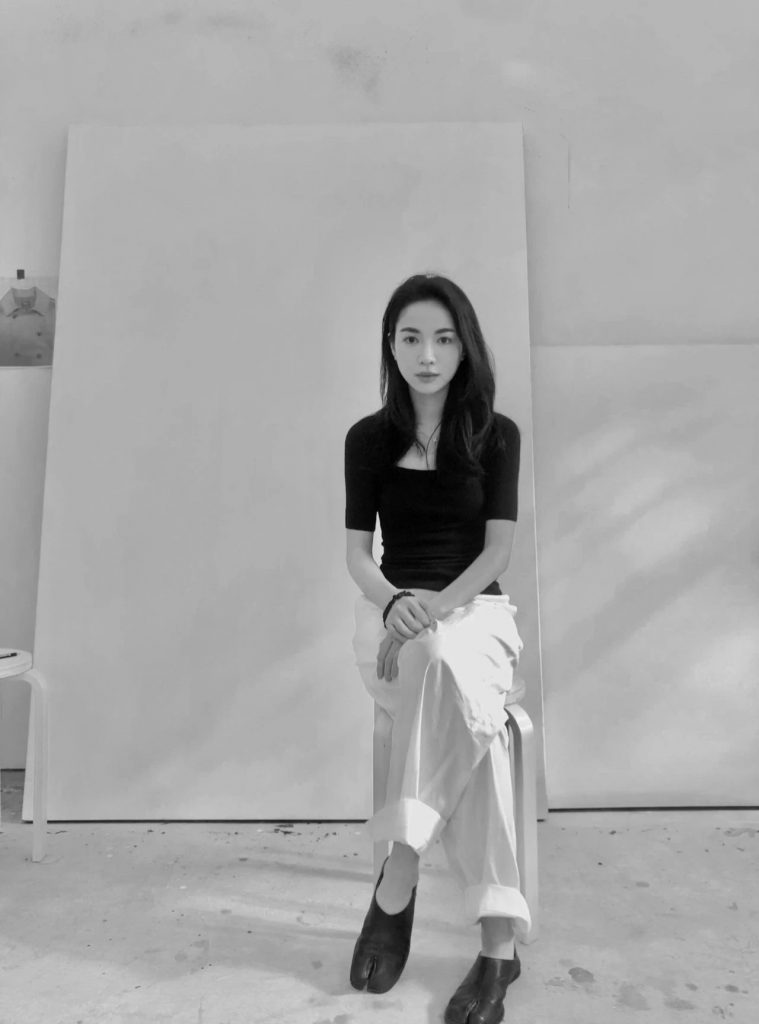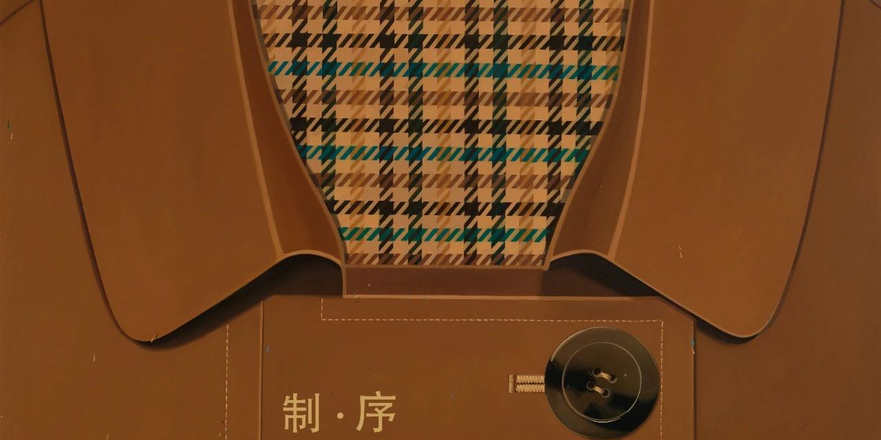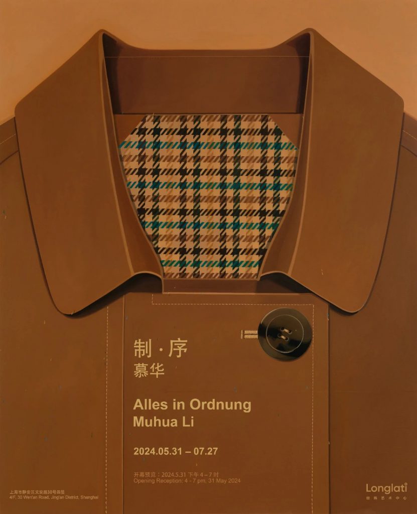
“Alles in Ordnung” will present the second residency artist, Muhua, showcasing the results of a one-year residency at Longlati. The exhibition will feature 22 pieces on canvas and wood panels, demonstrating the painting language developed during the residency.
「”From a very young age, I was drawn to things with a sense of order and regularity, such as the arrangement of a piece of chocolate, the way words are organized on the pages of a book, the plaid patterns on my mother’s clothes, the grid of herbal drawers in my grandfather’s clinic, the patterns derived from equations in math class, or the color cards arranged by the teacher in art class. In my memories, they always shine with a warm, subtle glow.”」
——Muhua Li
The objects that surround us in our present and past lives serve as subjects for the artist’s brush. These objects contain a sense of order, and amidst the chaos and disarray, the artist seeks patterns of color, geometry, and form in every day. The balanced, centered, and idealized compositions inevitably evoke the visual language of Wes Anderson’s cinematography. The stripes on a shirt, the houndstooth lining of a trench coat, and the orderly arrangement of colored pencils are all elements tied to personal sensory experiences of growing up. Compared to the flatness of the trench coat and shirt, the fabric folds of an umbrella recall the depiction of drapery by the Northern Renaissance painter Jan van Eyck. The colors possess a similarly subtle and profound quality, embodying the structure and rigidity of the fabric folds.
Muhua Li, Untitled, 2024, oil on canvas, 200 x 140 cm.
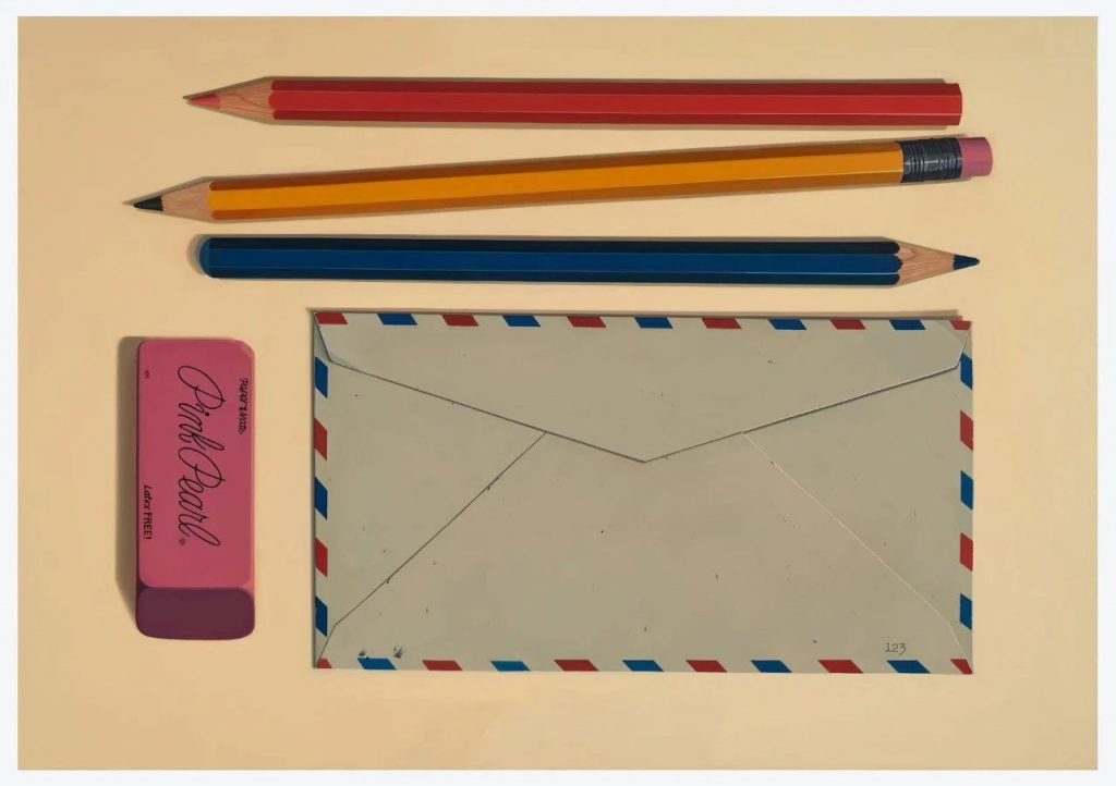
Memories of growing up are the beginning of everything. Beyond serving as vessels of memory, the stationery series delves deeper into the exploration of abstract language, encompassing color blocks, calligraphy, and barcode symbols. The pencils “Red 01” “Orange 01,” “Yellow 01,” “Green 01,” and “Blue 01” correspond to the spectrum of colors perceived by humans through the refraction of light. The names at the ends of the pencils, such as Scarlet, Orange, Naples Yellow, Yellow Green, and Marine Blue, offer a more detailed linguistic definition of colors within their respective color families. This naming process not only designates a specific color but also highlights the tension between logic and experience. While logically, a pencil can be assigned a specific color, experiential observation shows that each facet of the pencil exhibits different hues under varying conditions of time, environment, and light. As Wittgenstein notes in Remarks on Colour, “a language-game: Report whether a certain body is lighter or darker than another. — But now there’s a related one: State the relationship between the lightness of certain shades of color. (Compare with this: Determining the relationship between the lengths of two sticks–and the relationship between two numbers.). — The form of the propositions in both language-games is the same: “X is lighter than Y”. But in the first it is an external relation, and the proposition is temporal, in the second it is an internal relation, and the proposition is timeless.”
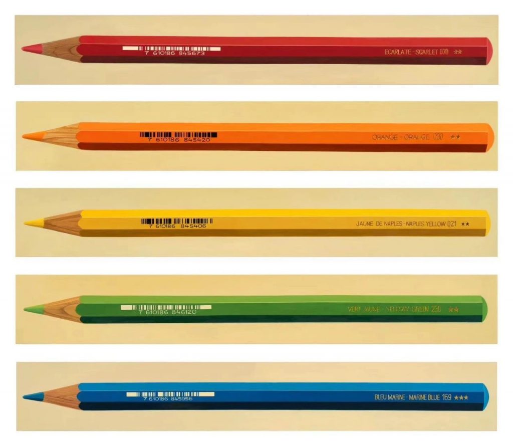
Muhua Li, from top to buttom: Red 01, Orange 01, Yellow 01, Green 01, Blue 01, 2024, oil on wood, each 140 x 20 cm.
“I perceive azaleas as the color red, rather than seeing the color red itself. ” It also reminds us of the various shades of red that are named after pigments, such as Indian Red, Vermilion, Venetian Red, Alizarin Crimson, Burgundy, Scarlet, and more. While all these can be called red, their brightness, saturation, and warmth vary when applied to the same canvas. The different origins of the materials used to create them also contribute to their distinct names. When we discuss “red,” the shade each person envisions is different. In other words, there exists only a relative or comparable notion of “red” rather than an exclusive and definitive concept of “red”.
Goethe, a poet with a heightened appreciation for color, defined color as the interplay between “light and shadow.” In his Theory of Colours, he describes yellow as, “Yellow is the color closest to light; it is a warm and restrained hue. It is the soft, gentle glow that remains as white gradually fades into darkness.”
Whether describing color through logic or poetry, it is unlikely to satisfy everyone, further highlighting the unreliability and uncertainty of language, and so it is important to acknowledge that there are certain aspects that cannot be adequately expressed.
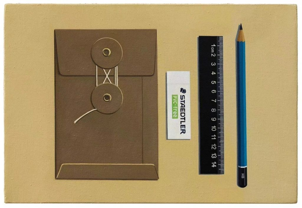
Muhua Li, Untitled, 2023, oil on canvas, 32 x 22 cm.
The canvas depicts daily objects in a subdued and introverted manner, with a hint of puritanical restraint. In this context, these objects are not about consumption, and the tranquil brushstrokes differ from Byung-Chul Han’s concept of “smooth aesthetics.” Here, the objects serve as vessels of memory and pathways for extracting abstract language from the tangible. The slow brushstrokes and gentle colors offer a way to clear emotions and enter a state of tranquility.
About the Artist
